Back
Ewayprint App
Ewayprint App
A mobile application that allows users to order printouts and have them delivered to any location of their choice.
A mobile application that allows users to order printouts and have them delivered to any location of their choice.
👨 Role: UI/UX Designer

🤔 Challenge
🤔 Challenge
Upon reviewing the previous version of the app, I identified several issues that were negatively impacting the user experience:
Upon reviewing the previous version of the app, I identified several issues that were negatively impacting the user experience:
Unstructured UI
Unstructured UI
The old user interface featured oversized icons, inconsistent spacing and fonts, and a poor color scheme, making the UI unstructured and unintuitive.
The old user interface featured oversized icons, inconsistent spacing and fonts, and a poor color scheme, making the UI unstructured and unintuitive.
Confusing User Interaction
Confusing User Interaction
The lack of visual cues and an intuitive design made it difficult for users to place print orders, particularly when creating or selecting delivery addresses.
The lack of visual cues and an intuitive design made it difficult for users to place print orders, particularly when creating or selecting delivery addresses.
Transition to Paid Model
Transition to Paid Model
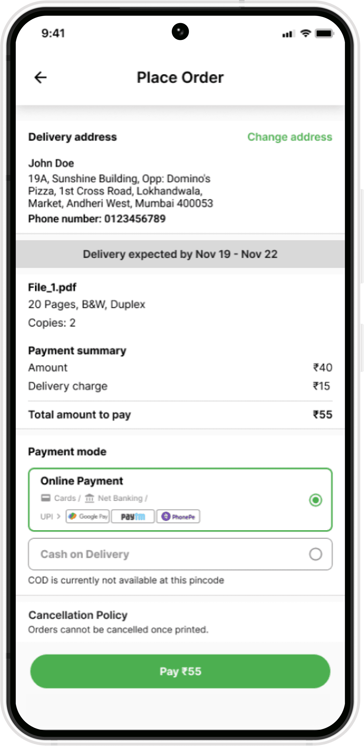
Previously, this service was free, allowing users to pay using vouchers. However, we transitioned to a paid model to enhance user experience. As part of this redesign, I had to integrated a payment method option into the checkout screen.
Previously, this service was free, allowing users to pay using vouchers. However, we transitioned to a paid model to enhance user experience. As part of this redesign, I had to integrated a payment method option into the checkout screen.


Some images of the old UI
✅ Solution
✅ Solution
To address these challenges, I implemented a comprehensive design system to restructure the UI and introduced a new user flow, enabling users to complete their orders seamlessly.
To address these challenges, I implemented a comprehensive design system to restructure the UI and introduced a new user flow, enabling users to complete their orders seamlessly.
Start of the Journey
Start of the Journey
The design process is rarely linear. I conducted multiple iterations to identify the optimal approach for the design system & a new user flow for order placement that delivered the desired results.
The design process is rarely linear. I conducted multiple iterations to identify the optimal approach for the design system & a new user flow for order placement that delivered the desired results.
Creating a Design System
Creating a Design System
Drawing inspiration from Material Design, I created a comprehensive design system. This included a color theme, interactive elements, and fonts, while retaining the firm's existing icons. This new design system significantly enhanced the user experience and improved the app's aesthetics by providing a well-structured framework.
Drawing inspiration from Material Design, I created a comprehensive design system. This included a color theme, interactive elements, and fonts, while retaining the firm's existing icons. This new design system significantly enhanced the user experience and improved the app's aesthetics by providing a well-structured framework.
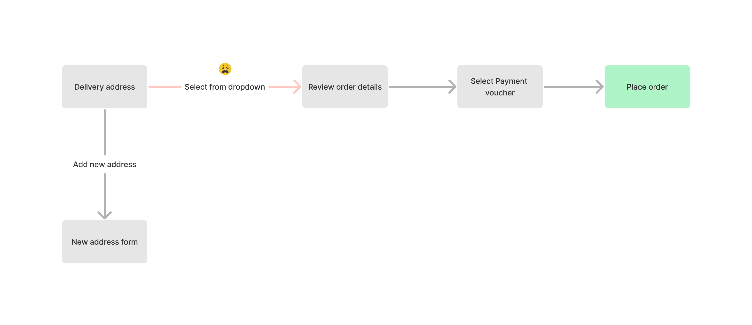
The Old User Flow for Placing Orders
The Old User Flow for Placing Orders
The previous user flow for order placement was problematic. The checkout process was cluttered, presenting —address selection, order details, payment methods, company policies, and the place order button—on a single page with a poor layout & visual hierarchy. This old, unstructured UI contributed to user confusion and frustration.
Address selection was particularly cumbersome, relying on a dropdown menu that obscured the full address, leaving users uncertain about their choices.
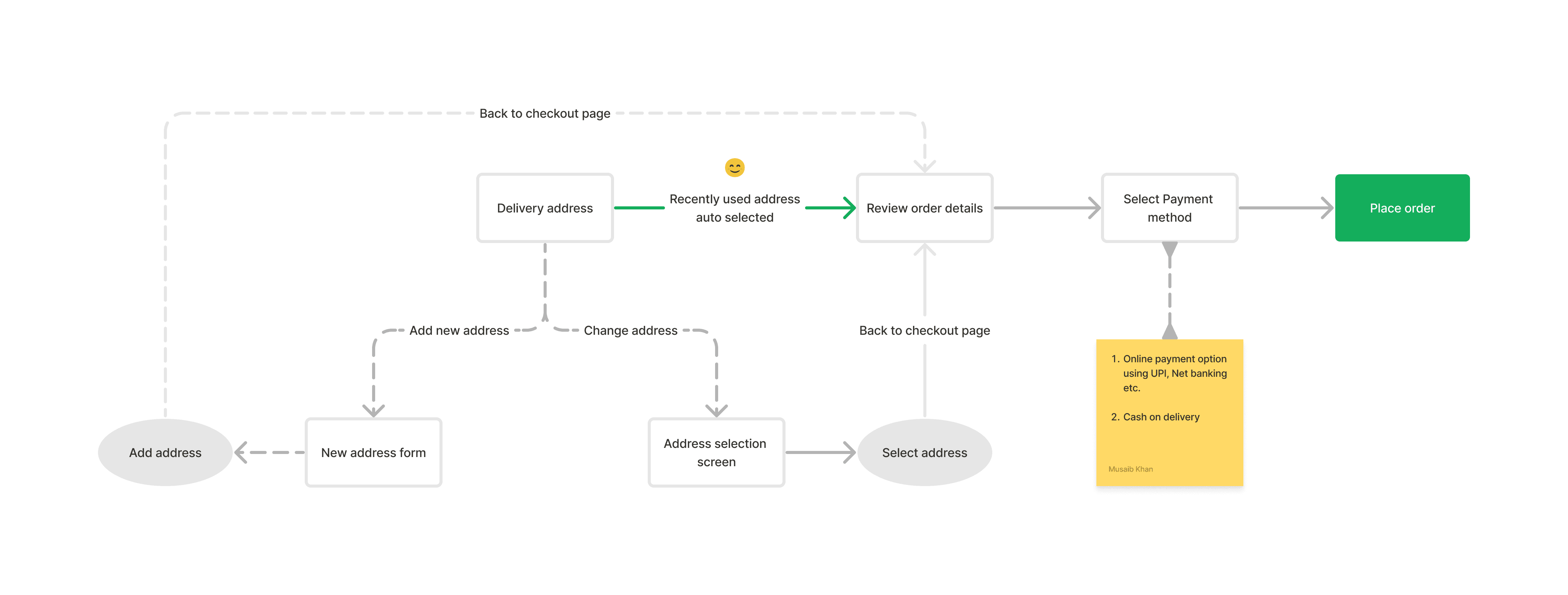
New User Flow for Placing Orders
New User Flow for Placing Orders
To address this, I adhered to Jacob's Law, which states that users spend most of their time on other products and thus prefer familiar interfaces. By studying user flows from other platforms, I designed a similar flow for our app, eliminating unnecessary learning curves for users.
To address this, I adhered to Jacob's Law, which states that users spend most of their time on other products and thus prefer familiar interfaces. By studying user flows from other platforms, I designed a similar flow for our app, eliminating unnecessary learning curves for users.
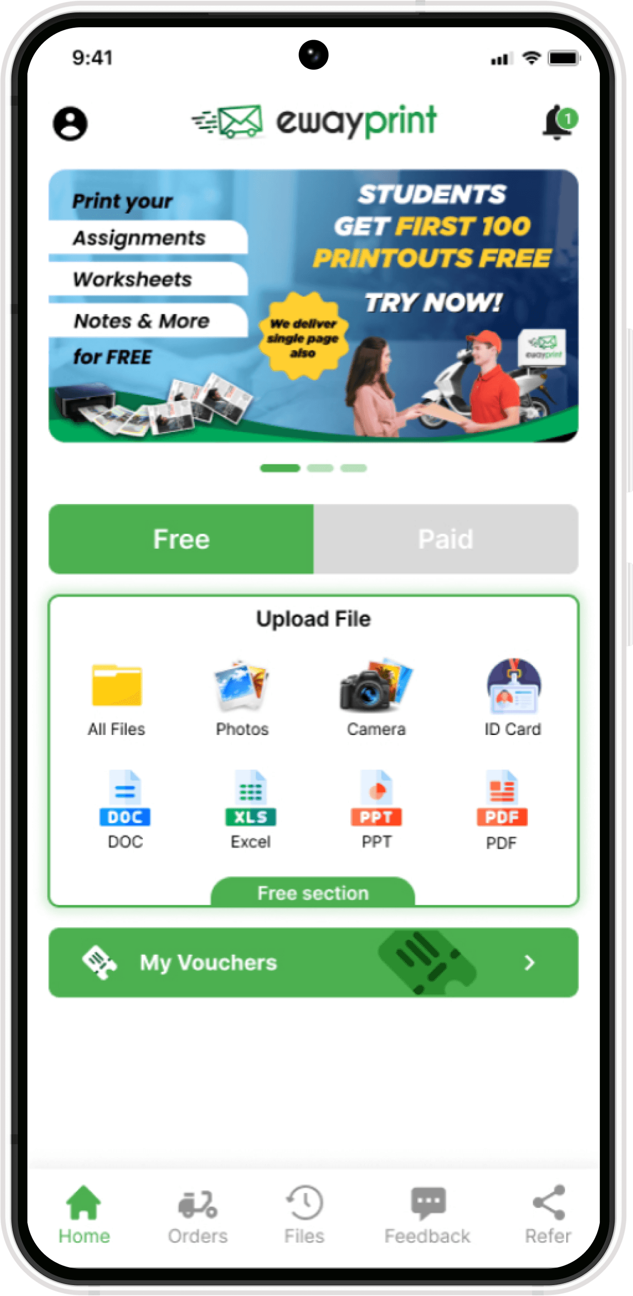
Final UI Design
Final UI Design